Notes on matplotlib
Challenges to new users
- Matplotlib has two interfaces. The first is based on MATLAB and uses a state-based interface. The second option is an an object-oriented interface.
- The reason two interfaces cause confusion is that in the world of stack overflow and tons of information available via google searches, new users will stumble across multiple solutions to problems that look somewhat similar but are not the same.
New matplotlib users should learn and use the object oriented interface.
-
Another historic challenge with matplotlib is that some of the default style choices were rather unattractive.
- Matplotlib 2.0 has much nicer styling capabilities and ability to theme your visualizations with minimal effort.
-
There is confusion as to when you should use pure matplotlib to plot something vs. a tool like pandas or seaborn that is built on top of matplotlib.
Reasons to use matplotlib
- The library allows you to create almost any visualization you could imagine
- There is a rich ecosystem of python tools built around it and many of the more advanced visualization tools use matplotlib as the base library.
Ways to use matplotlib
Basic Premises
Key steps for learning how to use matplotlib [1]
- Learn the basic matplotlib terminology, specifically what is a
Figureand anAxes.Figureis the final image that may contain 1 or more axesAxesrepresent an individual plot
- Always use the object-oriented interface. Get in the habit of using it from the start of your analysis.
- Start your visualizations with basic pandas plotting.
- Use seaborn for the more complex statistical visualizations.
- Use matplotlib to customize the pandas or seaborn visualization.
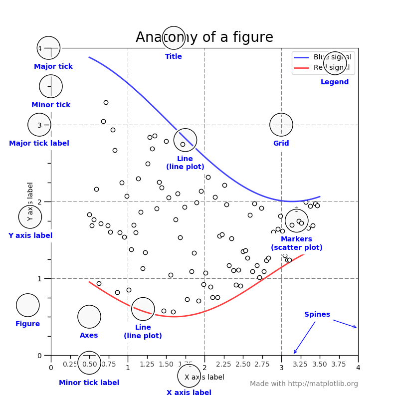
Parts of a Figure [2]

Making plots
import matplotlib.pyplot as plt
- Matplotlib has many different styles available for rendering plots. You can see which ones are available on your system using
plt.style.available.- Using a styple is as simple as:
plt.style.use('ggplot')
- Using a styple is as simple as:
Plot the data using the standard pandas plotting function
- It is a quick and easy way to prototype your visualization. Since most people are probably already doing some level of data manipulation/analysis in pandas as a first step, go ahead and use the basic plots to get started.
top_10.plot(kind='barh', y="Sales", x="Name")
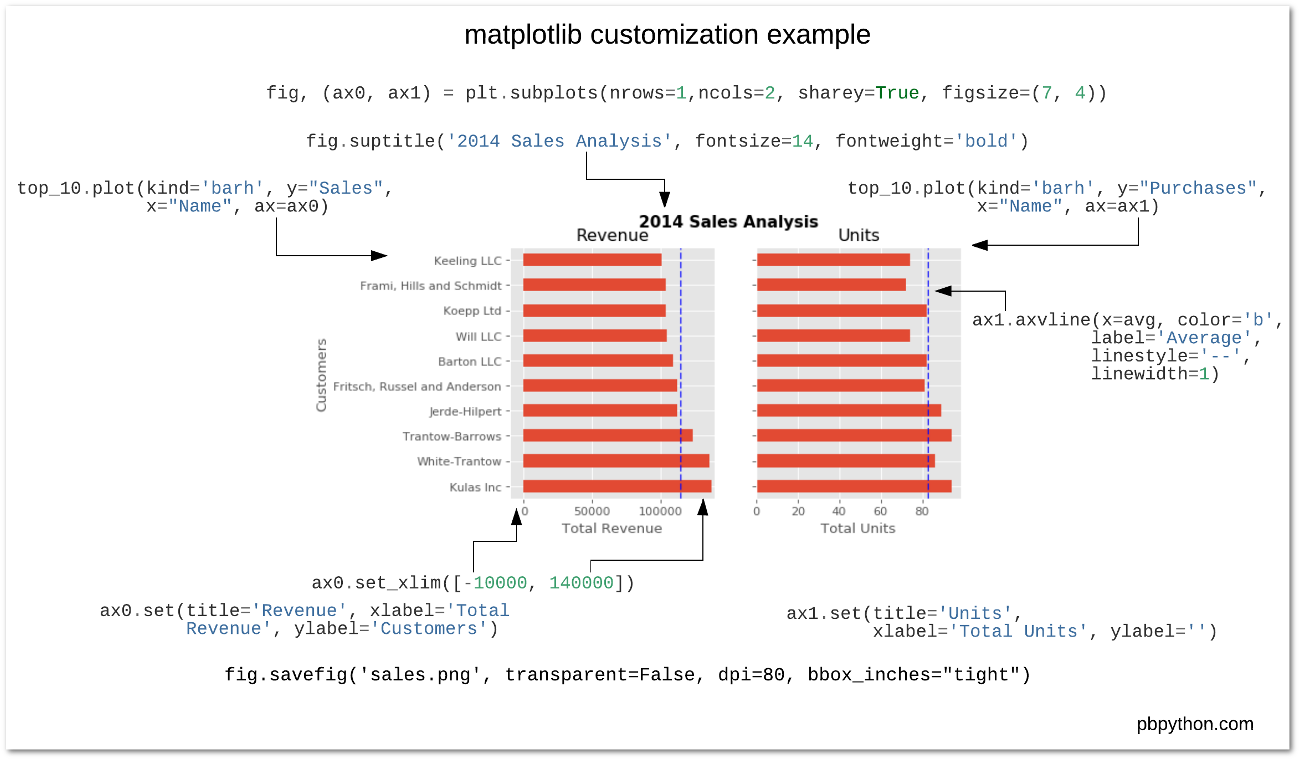
Customizing the plot
Multiple plots (axes) in one figure
